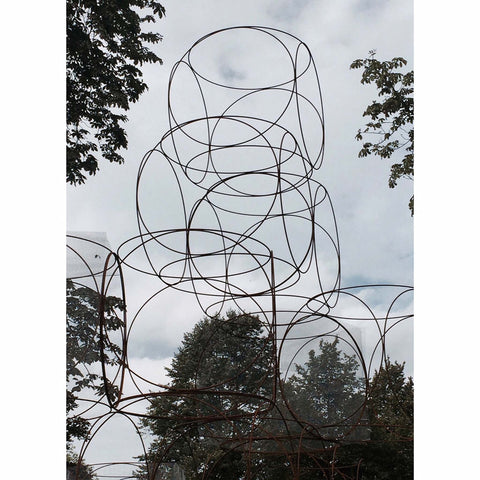
I came across architect Yona Friedman, or rather his work, in the Serpentine Gallery gardens in 2016. Summer House, pictured below, although huge (look at it compared to the height of the mature trees) is elegant, free and beautiful.
The structure builds upon his project La Ville Spatiale (Spatial City) which began in the late 1950s. "The manifesto for this project, published in 1959, was based on two pillars or principles: firstly, a mobile architecture that could create an elevated city space and enable the growth of cities while restraining the use of land; secondly, the use of modular structures to allow people to live in housing of their own design" states Yona Friedman.
Friedman designs structures which are purposely tricky to build in an exacting manner. He publishes manuals full of drawings - nothing in great detail, just quick fluid sketches, which he hopes will give builders the freedom to improvise and use what tools they have available to them. In other words he is creating ideas and inspiration which can be translated by whoever is building them making his designs accessible to a population of varying economic resources.
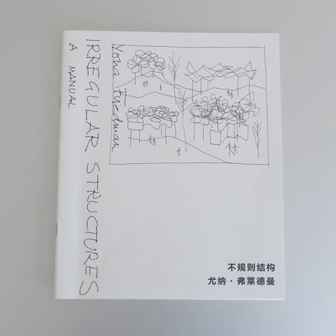
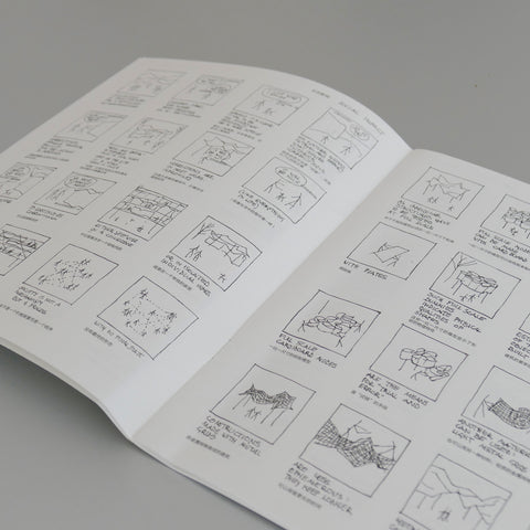
Shortly after seeing the Summer House in London, a friend returning from an extended work trip to China presented a book to me - Yona Friedman's Irregular Structures! He bought it in China and thought I would like it but hadn't realised I had recently come across Yona Friedman's work and had begun researching it. I was therefore delighted with the gift and when I looked more closely at the manual it became very apparent that Friedman could convey so much with so few lines.
I feel you can also convey so much with colour and made the decision to keep a daily colour diary - I drew a series of boxes just like Yona does to contain his sketches.
I choose a colour that I identify with each day. I don't over think it, it's a very quick decision - purely the colour I feel drawn to on a particular day. It hardly takes a second and gives an interesting colour palette each month and even more interesting an overview of colours I've identified with throughout the year. I tend to use water colours and pastels but again, like Yona suggests for his structures, you can and should improvise. You can use leaves, soil, petals, whatever you have to hand. Anything that makes a smudge of colour.
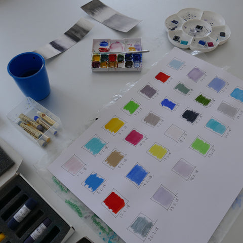
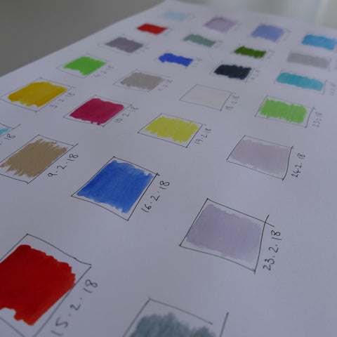
If you do decide to keep a colour diary, I would recommend you have seven squares across, one for each day of the week, so that you can look down the columns and see if say the four Saturdays in a month show any similarities or if Mondays look different to Fridays. Daft I know but very definitely fun and creates what I recon is quite an interesting colour study.
Interestingly, I heard about a study where soldiers suffering from post traumatic stress disorder were asked to 'describe' how they were feeling each day by pointing to a colour chart - red when they felt anxious, black when they felt despairing, blue when they felt well. It proved extremely useful as it was an easy, quick and direct way for the soldiers to open up about their mood especially when many were finding it difficult or awkward to actually say how they felt.
My colour diary is not meant to reflect a mood, I just find it interesting to see what colour I identify with each day and I'm careful not to look at the previous days colour incase I attempt to make a harmonious palette - it should be spontaneous!
Let me know if you decide to make one, I would love to hear how it goes.